
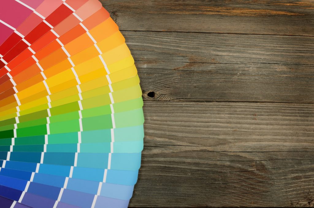
In a recent designer survey, 32% of respondents specified green/emerald as the color of 2020. Turning to color psychology helps you create the type of atmosphere you want in your home.
Contrary to popular belief, blue no longer holds the number one spot as America’s favorite color. Only 29% of the designer respondents said blue would be the “it” color of 2020. Good thing there’s a whole world of colors available for you to choose from!
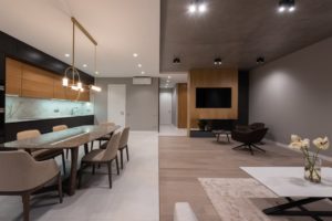
Your custom home should actually feel like home. Using the right colors will make your home look and feel more comfortable than ever.
Here are some of the best colors to paint your home’s rooms.
Pick a Home Color Palette
Defining your home’s color palette will help you make more fitting design choices. It’ll make the colors you encounter throughout the home feel more organized and seamless.
If you don’t know how to decide on a home color palette, look to other details in your living space. For example, start with your rug or furniture color(s), then work your way up.
You could also simply consider groups of tones you like. For instance, earth tones are popular because they’re calming and grounding.
Kitchen
When it comes to color psychology and home painting, always consider the effect you’re going for. In terms of kitchen styles, is your kitchen modern, contemporary, or traditional? The best kitchen colors amplify a kitchen’s style and energy.
Orange gives off vibrancy, warmth, and friendliness. It’s also known for stimulating the appetite. An orange kitchen is a perfect environment for promoting the enjoyment of good food and quality conversation.
Red is more “intense” than orange, but still good for kitchens. This color also stimulates your energy levels and appetite. Choosing a more muted red shade like rust red will lessen its intensity.
Bedroom
Sometimes, the best color psychology and custom home design strategy is to go with your preferences. Your bedroom is where your favorite colors matter the most.
People often paint their bedrooms blue for the color’s calming effect. Blue also stands for loyalty, trust, and security. Its cool, tranquil nature promotes better sleep habits and quality.
Living Room
People often choose off-white tones for their living rooms because they make the room look bigger. With other colors, always make sure they go well with the lighting options you’ve set in place. As a general rule, lighter colors make rooms feel more spacious.
Purple is trending as a popular modern color for living spaces. Light purple shades like lavender or lilac make living rooms feel serene yet stimulating.
Bathroom
A bathroom’s color psychology overview should promote calmness, rejuvenation, and relaxation. That’s why interior design experts recommend green for bathrooms.
Bold yellow shades are too “loud” for bathrooms. A pale shade of yellow is calmer while still exuding positivity and alertness.
Color Psychology Unlocks a Home’s Hidden Potential
According to Brynna Evans, an Interior Designer at Living Spaces, beige and gray color palettes are making a comeback. They pair well with muted accents like blue or purple.
Don’t forget: According to color psychology, dark colors make a room feel sophisticated and refined. They can also make a room look/feel smaller, so proceed with caution.
Upgrade your space—consult us now to start your custom home journey. You deserve to live in your dream home.


